A privacy-focused desktop and mobile browser ecosystem with a multi-million user base across five brands: Norton, Avast, Avira, AVG, and CCleaner.
Problems
When I joined the team, we had five browser products evolving independently — with different UX patterns, visual styles, and maturity levels. The inconsistent experience increased friction in key flows, made feature discovery harder, and slowed down product improvements. With millions of active users, every change had to be safe, scalable, and reversible.
Objective
The main product goal was to improve user engagement by:
- increasing the number of active users (MAU)
- increasing time spent in the product (session length)
Tasks
- Validated UX improvements through research, combining quantitative user testing and qualitative studies with the research team.
- Led UX/UI unification across 5 browser products, creating a single maintainable experience to reduce fragmentation and speed up future releases.
- Design, ship, and validate new features through iterative testing and experimentation
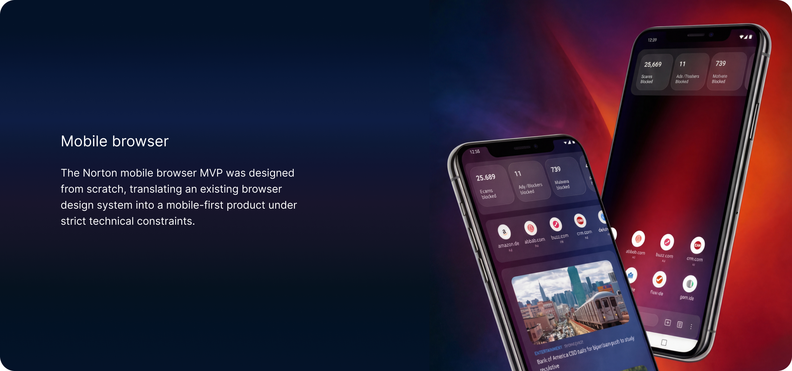
- Support the launch of the mobile browser MVP, ensuring cross-platform UX/UI consistency.
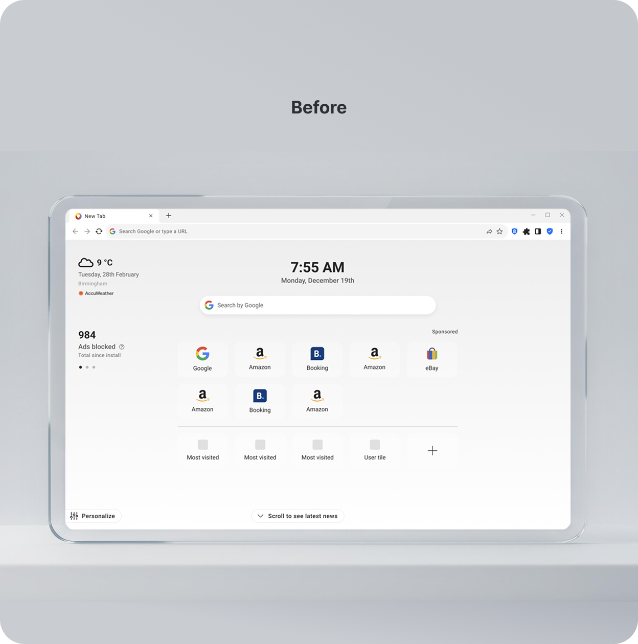
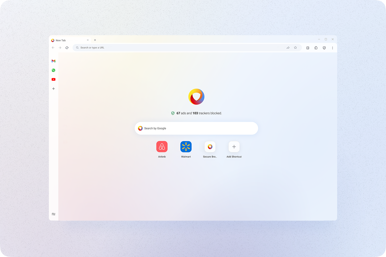
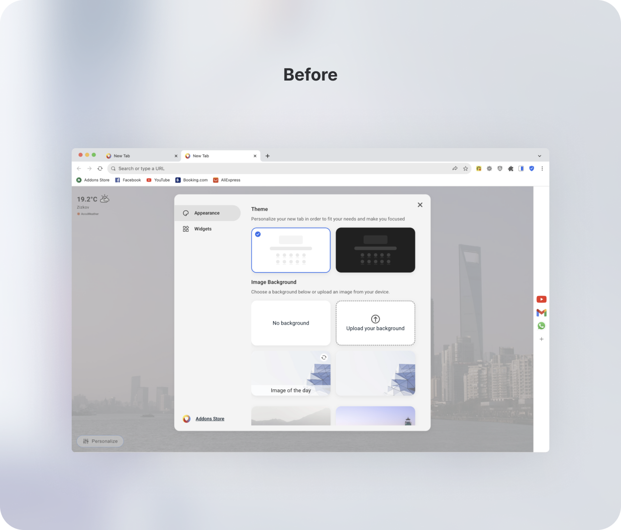
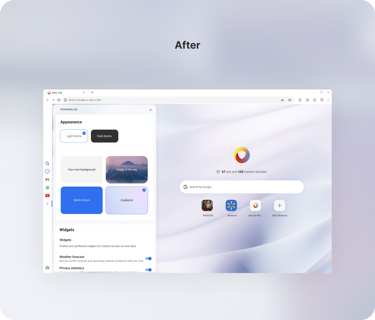
- The default New Tab page included preloaded widgets (clock, date, weather) that users didn't explicitly add, creating visual noise and distracting from primary actions.
- The layout lacked a strong information hierarchy, increasing cognitive load and slowing down navigation.
- Limited personalization prevented users from configuring the page around their habits, reducing long-term usefulness.
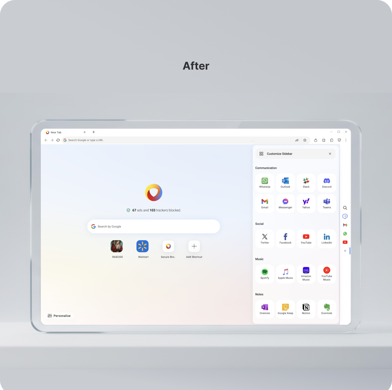
- Simplified the New Tab experience by removing unnecessary noise and creating a clear visual hierarchy around the primary actions.
- Increased personalization flexibility, allowing users to tailor the page based on their needs and habits.
- Validated the direction through qualitative research: tested 3 alternative page concepts and selected the final version based on user feedback.
- Introduced a customizable Sidebar to surface frequently used destinations and increase repeat engagement and time spent.
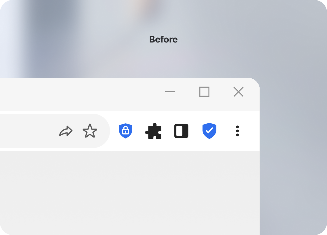
- Default toolbar icons lacked consistency.
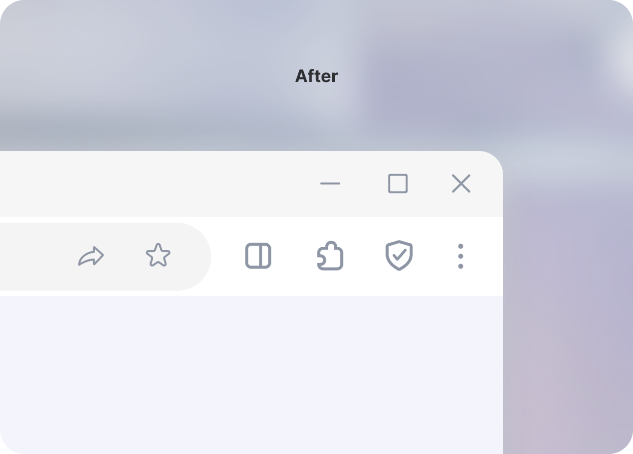
- Unified iconography and spacing to improve clarity and reduce visual noise.
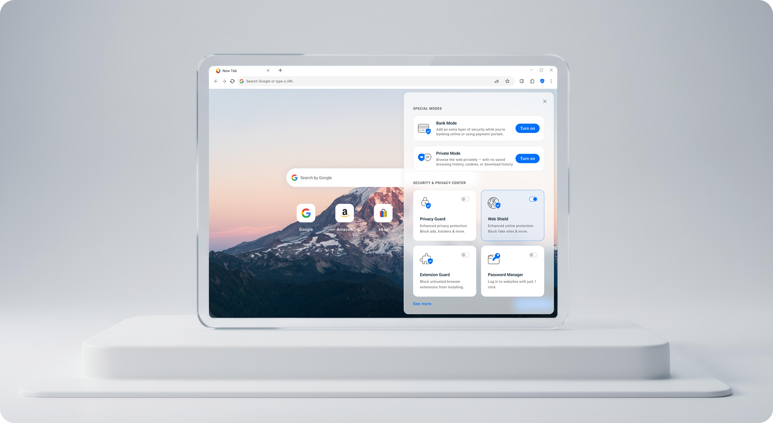
New features: Security & Privacy Center
Previously, security-related features were scattered across multiple, isolated pages: security modes lived separately and key controls were hidden deep in settings. This made managing security slow and unintuitive.
By centralizing security and privacy controls, we reduced friction in critical user flows and made protection more transparent and actionable, especially for non-technical users.
New features: Personalization
I simplified the personalization flow by moving settings into a dedicated left-side sidebar, separating configuration from the main content. This removed visual overlap, made active selections immediately visible, and reduced cognitive load.
My impact over 1.5 years
- Feature design & validation: designed and tested key browser capabilities (Side Panel, New Tab widgets, Security Center, etc.), contributing to a significant increase in time spent and engagement.
- UX / engagement improvements: worked on UX consistency and feature discovery initiatives, resulting in measurable growth in active users
- Design system: created and expanded a component library, enabling faster design iterations and cross-platform consistency across browser products.
- Mobile MVP (team of 2): shared ownership of the MVP design, validated critical flows, and supported delivery → launched the mobile browser.