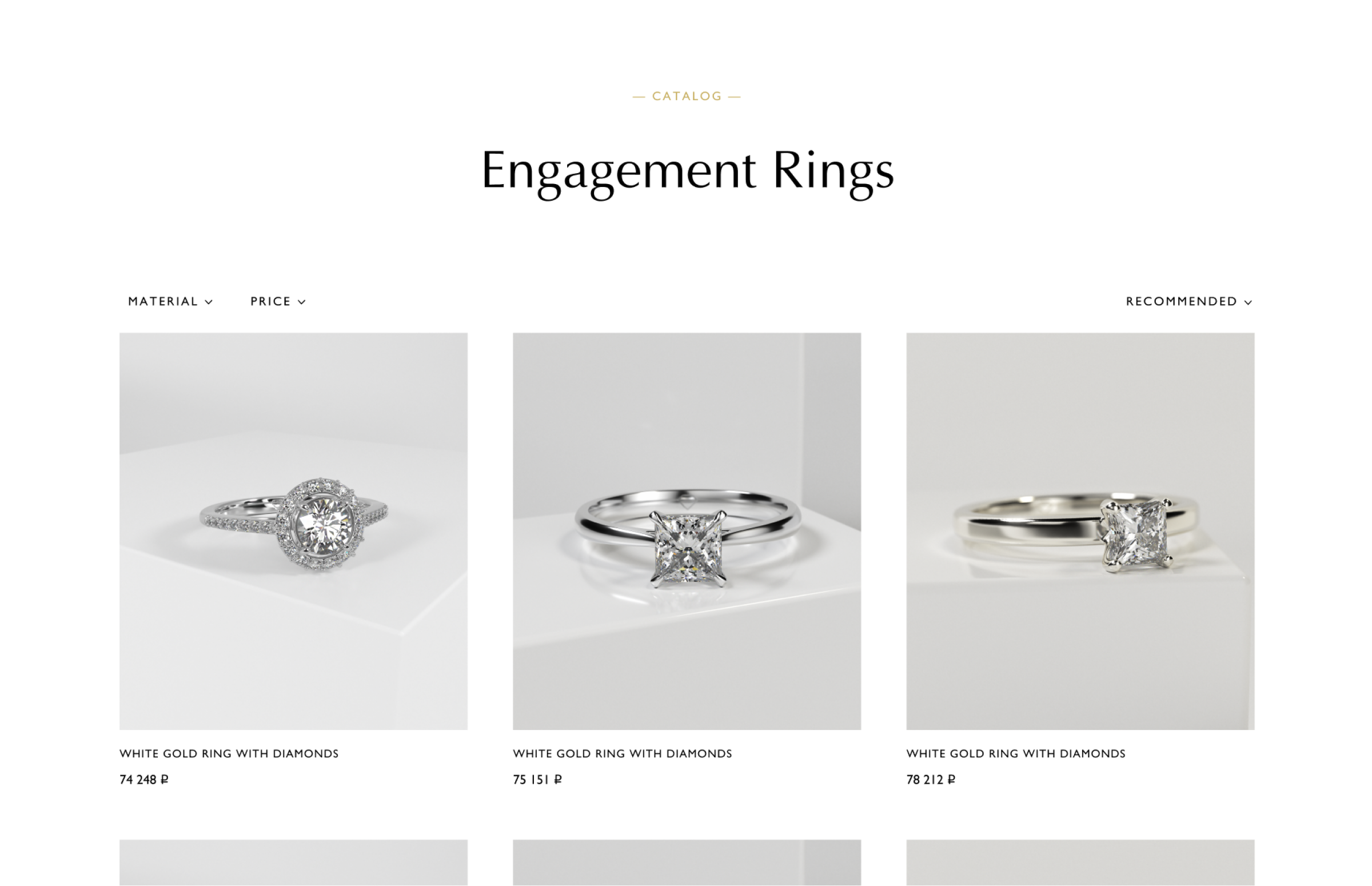
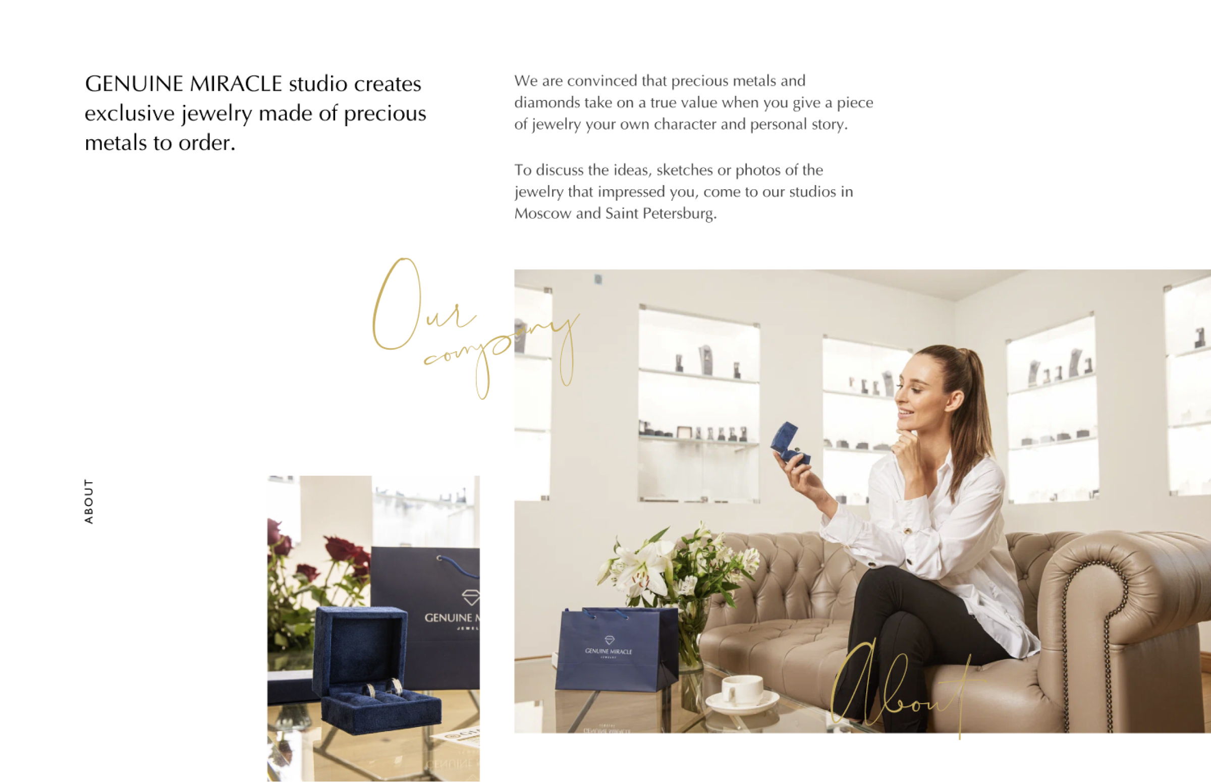
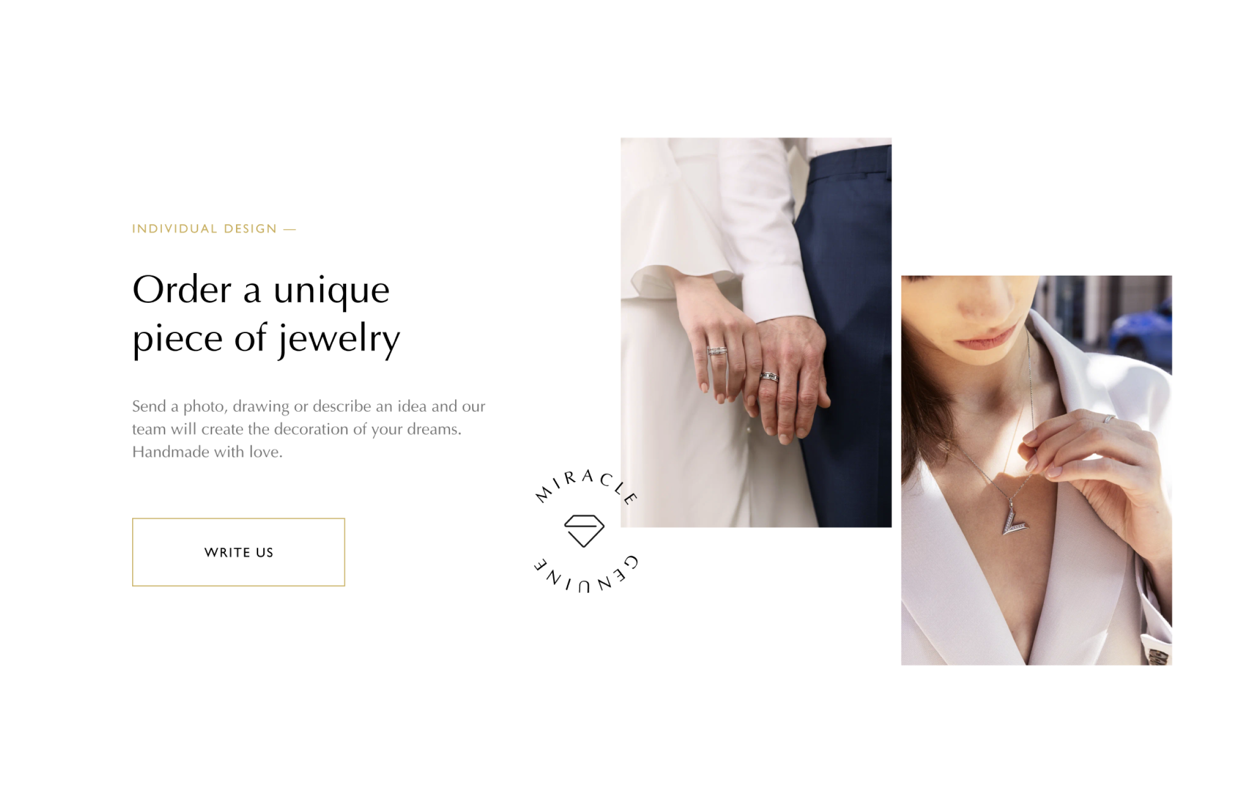
The website features custom-made jewelry. The user can order a piece of jewelry according to an existing design or order his own.
Task
To increase the conversion rate and the site began to make more profit. Given the budget and future plans, we focused on improving the existing design and user experience.
Process
The process was shaped by tight budget and deadlines. We prioritized high-impact tasks like optimizing product visualization and checkout flow, targeting 20% profitability growth in Q1.
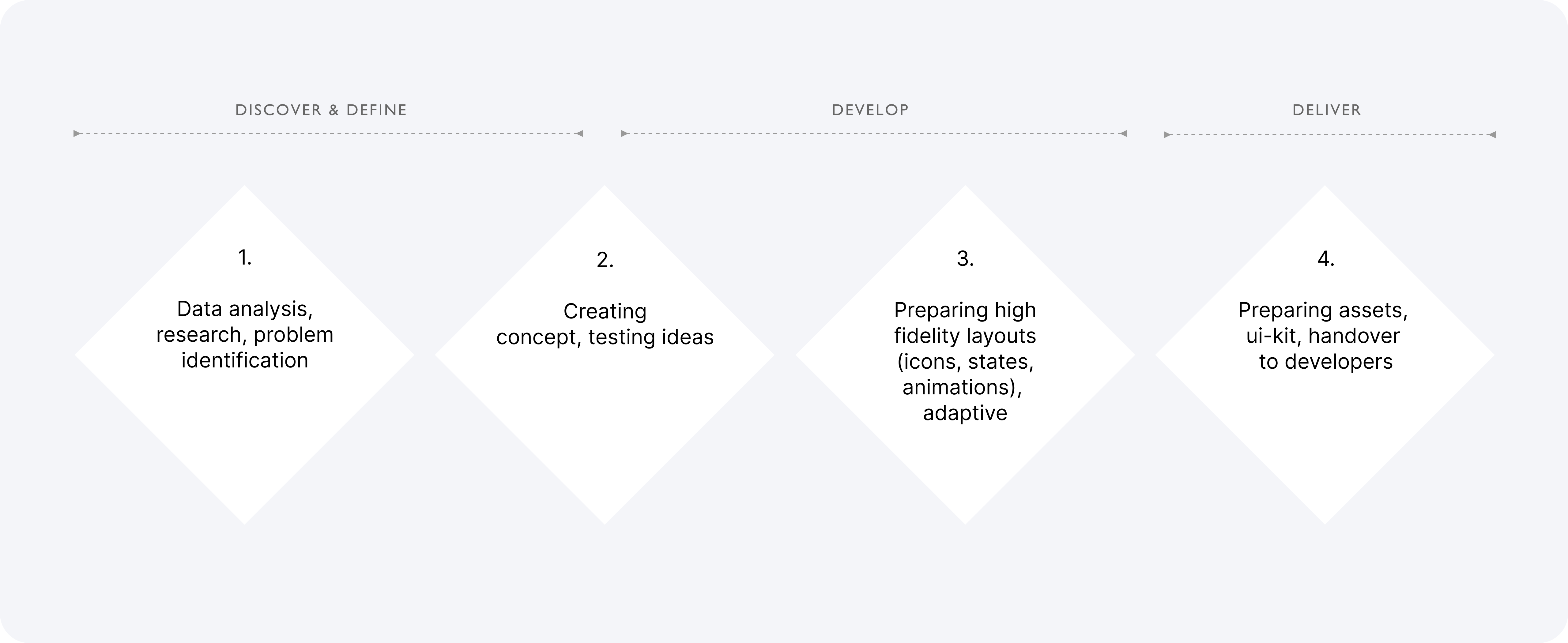
The process started with data analysis and problem identification: discussed business goals with stakeholders, analyzed user behavior via Yandex.Metrika, reviewed competitors, and formed hypotheses to boost site performance.
Key issues: messy user flow and funnel, unclear structure, excess info, cluttered navigation. Based on insights, we created concepts, tested with users, and refined solutions.
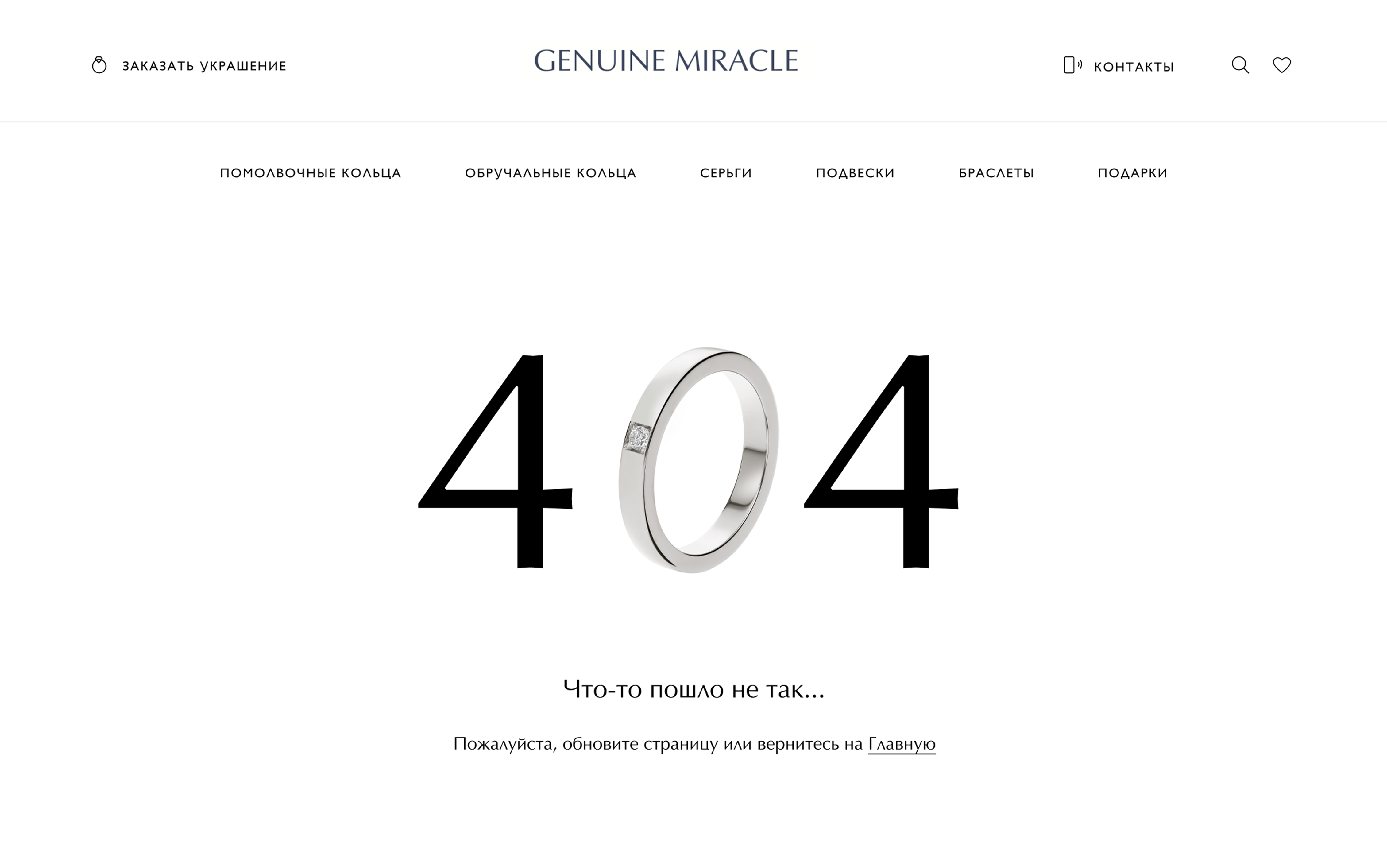
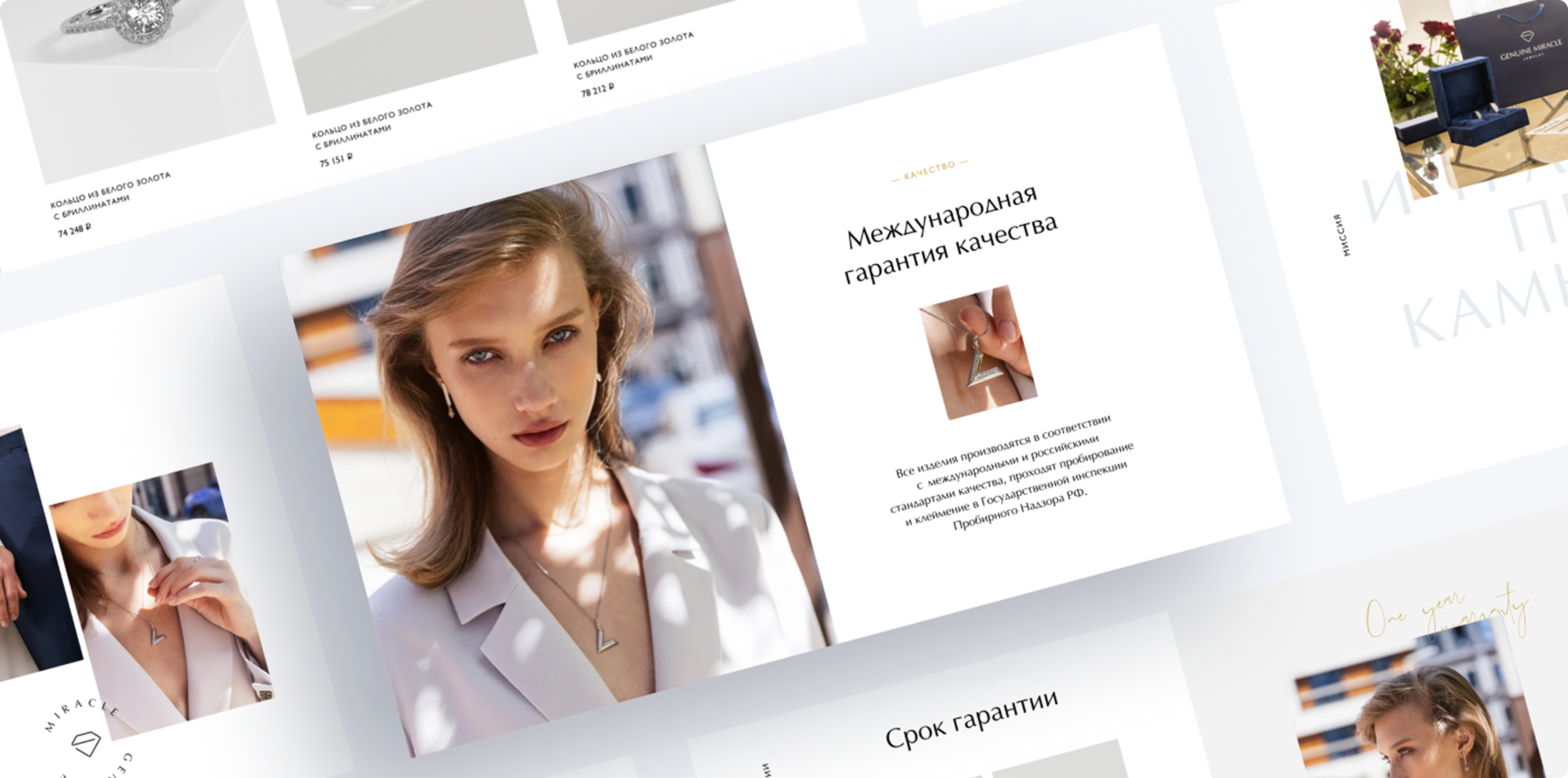
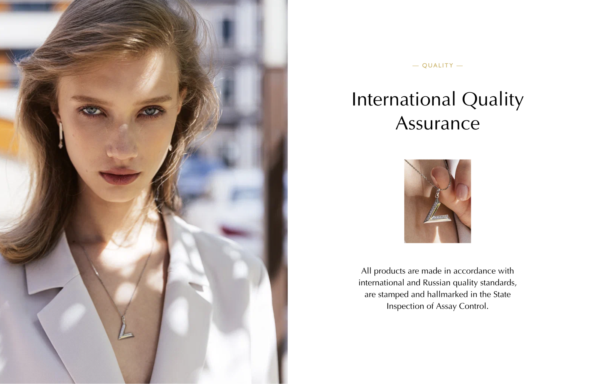
Restructured information for consistency: swapped sections, added service details, and optimized CTA buttons.
Simplified navigation per client agreement—removed redundant links, grouped content for clearer, intuitive user flow.
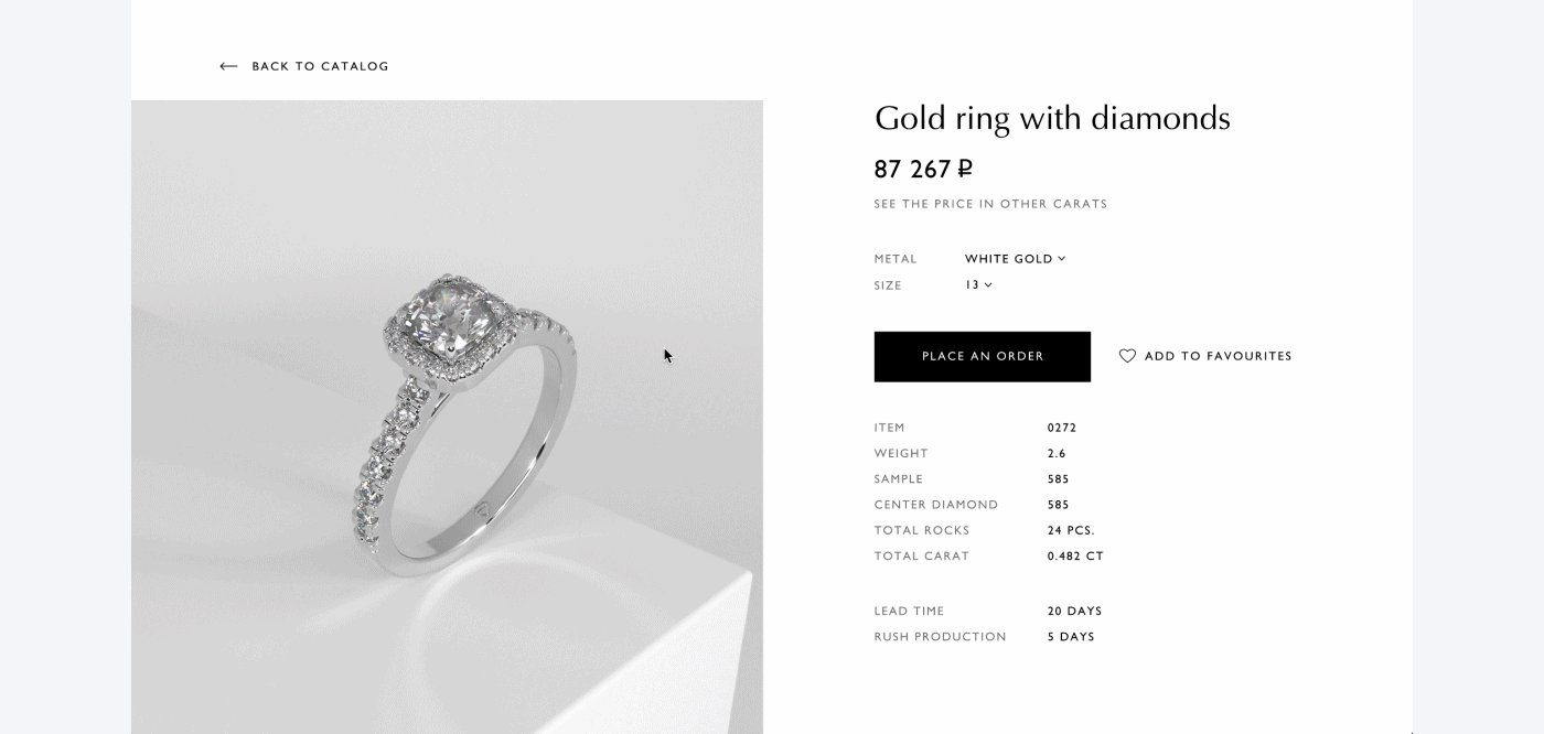
Improved visual consistency by removing unnecessary text styles, establishing a clear visual hierarchy, calculating optimal font sizes, and grouping related elements.
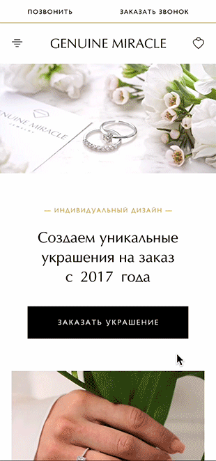
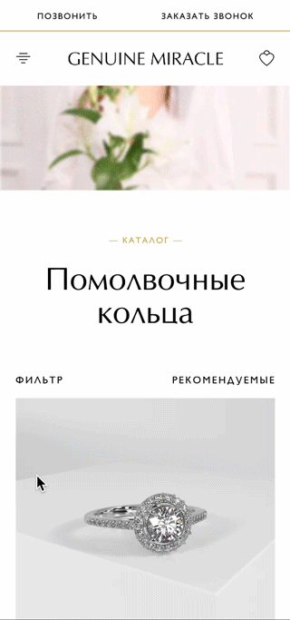
High fidelity layouts
Mobile version
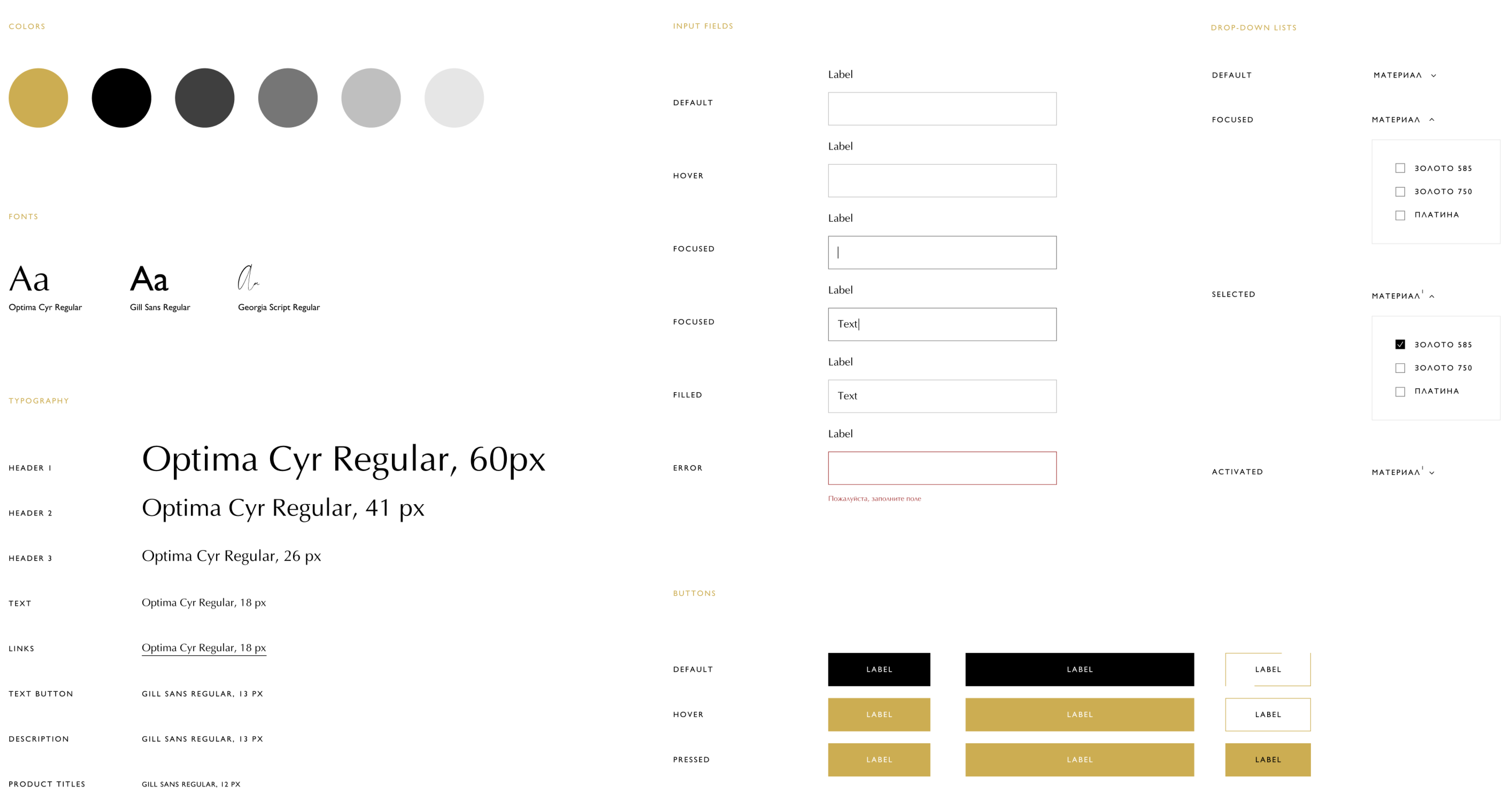
UI-kit and states
Outcome